edit: I don't think this camel shot even made it to round 2!
edit2: I think the puffin shot is going to win. Despite the fact that it's a great shot, I'm just jaded over puffins.
edit3: Interestingly, I must have 'thumbnail-blindness' because it's Poco's photo of the guy polishing livestock horns that's running away with the PotY. By 'thumbnail-blindness' I mean that I overlooked the photo because the thumbnail was not eye catching enough to me to warrant a more detailed look--definitely a flaw in how I select photos to look at, but I'm probably not the only one with this affliction. Puffin shot may make 2nd or 3rd place.
edit4: This also contradicts my 'theory' that the top vote-getters in Round 1 of PotY would be the top vote-getters in round 2 (± some noise δ) because Poco's photo wasn't even in the top-20 of round 1! It'd be interesting to make a map of ranking changes between rounds 1 and 2.
one of these 4 should win PoTY 2024 (imo)
one of these 4 should win PoTY 2024 (imo)
Strangely, this pic is FP, but not QI. one of these 4 should win PoTY 2024 (imo)
Beautiful minimalism.
... I'd love to watch someone do the focus stacking required for this type of pic. I assume there's focus stacking involved!
So far, this is my only 'fave' that prominently features a person.
overhead? ✓ minimalism? ✓ fave? ✓
This fared much better in PotY than I would have guessed.
six-σ to the right on the normal distribution.
I'm a sucker for minimalist overhead shots.
more minimalism
When I find the time (i.e., never), I need to start doing microscopic photography.
The usual knives are out for this one. It's pretty stunning, so I can understand the wariness. But some people consistently lob accusations with diamond-hard confidence and nothing to back those accusations up. I guess we'll see. edit: and we have seen!
Someone suggested a better crop and it definitely seems better. A wild photo. Seems like a building from Machinarium (video game).
Stunner! Just to grind an axe, however, I should note that no one has asked to see the RAW file for this one. To be fair, I don't really care to see the RAW, but it's my poor attempt at humor.
!!!!
would be on my short list for next year's PotY. as others have noted, it has a great painterly quality.

 one of these 4 should win PoTY 2024 (imo).
 one of these 4 should win PoTY 2024 (imo)
 one of these 4 should win PoTY 2024 (imo)
 Strangely, this pic is FP, but not QI. one of these 4 should win PoTY 2024 (imo)
.jpg/120px-Helmstadt-Bargen_-_Bargen_-_St._Peter_und_Paul_-_Decke_(1).jpg)
 Beautiful minimalism.
._29-08-2023._(d.j.b).jpg/120px-Bloemknop_van_een_blauwe_knoop_(Succisa_pratensis)._29-08-2023._(d.j.b).jpg) ... I'd love to watch someone do the focus stacking required for this type of pic. I assume there's focus stacking involved!
... I'd love to watch someone do the focus stacking required for this type of pic. I assume there's focus stacking involved!.jpg/120px-Saddhu_at_Durbar_Square%2C_Kathmandu_(edited).jpg) So far, this is my only 'fave' that prominently features a person.
So far, this is my only 'fave' that prominently features a person.2.jpg/120px-Toronto_Reference_Library_(01618)2.jpg) overhead? ✓ minimalism? ✓ fave? ✓
overhead? ✓ minimalism? ✓ fave? ✓_-_9978.jpg/120px-View_of_Abeno_Harukas_and_Shitennō-ji_five-storied_pagoda_at_dusk%2C_January_2024_(clone_version)_-_9978.jpg)

.jpg/120px-Santa_Maria_in_Trastevere_church_in_Rome_(12).jpg)

 six-σ to the right on the normal distribution.
 I'm a sucker for minimalist overhead shots.
.jpg/120px-Casal_de_turistas_caminha_em_uma_duna%2C_enquanto_o_dia_morre_nos_Lençóis_Maranhenses_(edited).jpg) more minimalism
more minimalism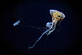 When I find the time (i.e., never), I need to start doing microscopic photography.
_-_Common_Sergeant_(4)_WLB.jpg/120px-Close_wing_Basking_of_Athyma_perius_(Linnaeus%2C_1758)_-_Common_Sergeant_(4)_WLB.jpg) Talk about reversal of fortunes! Commons:Featured picture candidates/File:Close wing Basking of Athyma perius (Linnaeus, 1758) - Common Sergeant (4) WLB.jpg edit: This photo and the "controversy" surrounding its FP nomination should be turned into a movie. Next up on FPC: The Zapruder film.
Talk about reversal of fortunes! Commons:Featured picture candidates/File:Close wing Basking of Athyma perius (Linnaeus, 1758) - Common Sergeant (4) WLB.jpg edit: This photo and the "controversy" surrounding its FP nomination should be turned into a movie. Next up on FPC: The Zapruder film._-_Common_Cerulean_(2)_WLB.jpg/120px-Mating_pair_of_Jamides_celeno_(Cramer%2C_1775)_-_Common_Cerulean_(2)_WLB.jpg) Normally, I'd try to avoid "favoriting" similar types of photos (e.g., multiple butterfly photos), but hot-damn, User:Anitava_Roy is quite good.
Normally, I'd try to avoid "favoriting" similar types of photos (e.g., multiple butterfly photos), but hot-damn, User:Anitava_Roy is quite good. Reminds me of my dining hall in grad school.
.jpg/120px-Museum_of_contemporary_art%2C_Belgrade_(Музеј_савремене_уметности_Београд).jpg) This building feels like it should be in A Clockwork Orange.
This building feels like it should be in A Clockwork Orange.
_монастыря_8.jpg/120px-Ансамбль_Ново-Иерусалимского_(Воскресенского)_монастыря_8.jpg)

 More overhead minimalism--with a message.
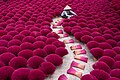 My vote for PotY
 Scorsese could've used this shot in The Departed.
 let me get ahead of the curve on this one
 This has "wow." Interestingly, the views on the FPC page were mixed. Chief complaint was "too dark" I think. But ... I like it.
 I'm preaching to the choir on this one because everybody over at FPC loves this.
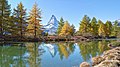 As far as I'm concerned, there is no bad shot of Monte Cervino. But even with that axiom, this is better than most.
 Lots of "wow" here.
 amazing
 Another stunner. Apparently, the water is not quite level, but hopefully it gets sorted out. Even w/o correction, it's still 🤌.
 Has an Edward Hopper feel to it.
 Like a painting.
 stunner
 !!
!! This is just beautiful.
 Another with that Hopper vibe.
 Has a similar vibe to last year's PotY.
 You can never have enough Hopperesque photos.
 The usual knives are out for this one. It's pretty stunning, so I can understand the wariness. But some people consistently lob accusations with diamond-hard confidence and nothing to back those accusations up. I guess we'll see. edit: and we have seen!
.jpg/120px-Southside_elevation_of_Virupaksa_temple%27s_Galigopuram_during_sunrise_(Symmetry).jpg) Someone suggested a better crop and it definitely seems better. A wild photo. Seems like a building from Machinarium (video game).
Someone suggested a better crop and it definitely seems better. A wild photo. Seems like a building from Machinarium (video game). Stunner! Just to grind an axe, however, I should note that no one has asked to see the RAW file for this one. To be fair, I don't really care to see the RAW, but it's my poor attempt at humor.
._10-07-2025_(d.j.b.).jpg/120px-Drie_bloemknoppen_van_een_Hertshooi_(Hypericum)._10-07-2025_(d.j.b.).jpg)


 !!!!
!!!!.jpg/120px-Meadow_in_the_Smoky_Mountains_(41665h).jpg) would be on my short list for next year's PotY. as others have noted, it has a great painterly quality.
would be on my short list for next year's PotY. as others have noted, it has a great painterly quality.


.jpg)

._29-08-2023._(d.j.b).jpg)
.jpg)
2.jpg)
_-_9978.jpg)

.jpg)


.jpg)

_-_Common_Sergeant_(4)_WLB.jpg)
_-_Common_Cerulean_(2)_WLB.jpg)

.jpg)

_монастыря_8.jpg)


.jpg)

._10-07-2025_(d.j.b.).jpg)


.jpg)
_-_Common_Sergeant_(4)_WLB.jpg)